⛵ Setting sail
You may have noticed some more minor UI improvements lately, including the new “C” hotkey to build a castle. But now I’m going for a big one: Total overhaul of the level select UI! continue reading for a bit more info about that.
World map!
I’ve been itching to do something about the awkward level select UI for a while now, so I decided this will be my first step towards the larger content overhaul.
Currently, the level select “experience” consist of two separate screens - the grid view with numbers and the single level detail view. And both of them are annoying in their own ways. I’m planning to replace them with a single screen, which should seamlessly combine:
- A world map on which you navigate between islands.
- A convenient searchable/filterable list of all levels in the campaign.
- A card with details about the currently selected level.
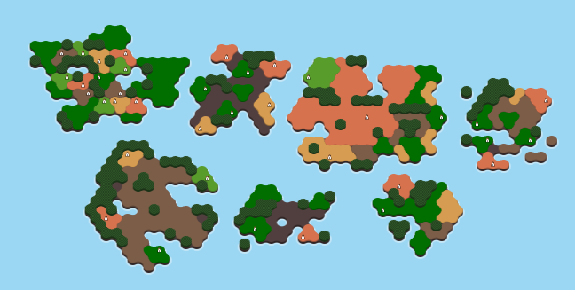
Above, you can see an early version of the new island preview graphics for the world map! I was a little nervous about making it performant enough to show dozens of islands at once, but early results look promising!
For the style of the UI elements, I definitely want to get rid of the cold, sterile blue/white UI aesthetic entirely. I’ve been experimenting with a few different ideas, and I’m going to really dive into that next weekend. This is not just about the level select screen, but about establishing a new style for all the existing and upcoming menu screens across the game. Which is to say this may take some time. I’ll be really trying to get this right and upgrade my UI design skills a little bit in the process.
Expect some detailed UI mockups (possibly with an opinion poll attached) soon!